Logos & Icons
Burger King x Jurassic Park (2020)
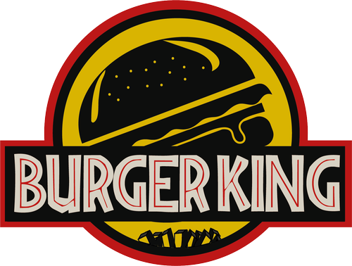
This redesigned Burger King logo was inspired by both current Burger King logo and color scheme of the Jurassic Park logo.
The central element of the logo is a stylized dinosaur, reminiscent of the iconic Tyrannosaurus Rex from Jurassic Park. Changed the main element from bone of T-Rex to burger and from lush tropical foliage, palm trees on the bottom to the fries.
For the typography, use a bold and strong font to spell out the words “Burger King” beneath the logo. The font can have a slightly rugged and weathered appearance to reflect the adventurous and prehistoric theme.
This logo was done during the course of Graphic Design back to the uni.
Koala Stalker (2020)
The logo of Koala Stalker website was designed for a website which was related to koala reservation. A Koala, a hat as well as red cross symbol were used as features of the logo.
Cherno BattleLand (2019)
The logo of Cherno BattleLand was designed based on the location and the theme of the resort. As such, the elements such as radiation sign and paintball mark can be seen from the logo. The visual elements in this logo include splashing paintball effect with some text and radiation sign.
Mibase Toy Library (2018)
Logo designed for Mibase toy library Australia. Selecting typical kangaroo which indicates the base of the company as outline, then the puzzles as pattern filled inside the outline. The letter ”M” represents the name of the company.
Some practices and facsimiles on existing brands logos
To a graphic designer, it is vital to learn anytime from anything especially something existing and inspirational, sometimes practicing and facsimileing are meaningful to a designer. Through constant practices, the Inspiration and Reference can be got, the skill can be developed, and even more, a better cultural understanding and conceptual insight can be gained.
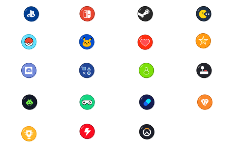
Personal designed icons
Since having worked with design system and related experience in maintenance in previous company, I totally understand the significance of the icons to the design systems. Icons design is always the aspect of visual design I keep paying attention to and keep practicing.
There are some examples of my works on icons both during work and personal practice.
For the reason of confidential, part of the icons or names may be mosaicked.
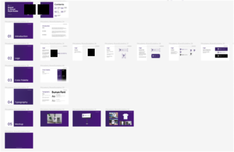
Branding guide production
Basically, the branding produced by me often consists with following components:
Brand Overview: This section provides a brief description of the brand or company’s mission, values, personality, and positioning. It sets the tone for the brand and provides context for the rest of the guide.
Logo Usage: Detailed guidelines on logo usage are included, specifying rules for size, proportions, clear space, and placement. It may include variations of the logo for different use cases, such as horizontal, vertical, or alternative versions.
Color Palette: The guide defines the primary and secondary color palette for the brand. It specifies the color codes (such as hexadecimal or RGB values) for each color and provides guidance on their appropriate usage, including background colors, typography, and accents.
Typography: Information about the fonts and typography used by the brand is outlined in this section. It may include guidelines for headings, subheadings, body text, and any specific fonts to be used for print and digital materials.
Brand Applications (Mockups): Instructions on applying the brand elements to various mediums are provided in this section. It covers guidelines for stationery, marketing collateral, digital platforms, social media, advertisements, packaging, and any other relevant materials.
